
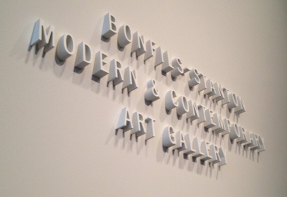
On a recent visit to the Hamilton Building of the Denver Art Museum, I noticed some stunning “new” signage – 3-D Letters set out from the heavily angled walls, which labelled the entrances to galleries. (I place “new” in quotes because I have no clue when the signage went up, as I hadn’t been there in a while.) They were quite simple – white letters in a san-serif font, set in title-case – however the shadows created by the lighting and angels was very dramatic, and complimented the architecture of the building perfectly. They look almost as if they sprouted organically from the wall. It was the perfect marriage of modern architecture and typography.